Tuesday, March 25, 2014

Using ScrollViewer in Windows Store Apps - Determining Scrollable Contents

In this post, we will be trying to discuss options available to determine whether ScrollViewer's contents are partially hidden. The options would be looked at from a Windows Store App perspective. But they are quite generic and should be easily usable in other XAML based platforms including WPF and Silverlight and Windows Phone applications.

Let's first add an image to our project. We would be using pan and zoom with this image to understand how we can determine whether we have any horizontal and vertical scrollable content. Here we are setting the Build Action as 'Content'. This would allow us to use ms-appx:// Uri syntax to reference the image. In those cases, we would be showing some content in the application. They would be just TextBlocks showing details of available scrollable contents.


ComputedHorizontalScrollbarVisibility and ComputedVerticalScrollbarVisibility
As we know we can use HorizontalScrollbarVisibility and VerticalScrollbarVisibility to set whether and when scrollbars should be available. They are both of type ScrollbarVisibility. The possible values are Auto, Disabled, Visible and Hidden. The values are irrespective of whether the scrollbars are currently displayed or not.

ScrollViewer provides another set of properties to determine whether scroll bars are currently displayed or not. It must be remembered that this is irrespective of whether we have any available scrollable regions. They are read-only properties, and named as ComputedHorizontalScrollbarVisibility and ComputedVerticalScrollbarVisibility. They are useful when the options to set the visibility are set as Auto.

In the following example we are adding an image to ScrollViewer. Since we need Panning and Zooming, we have enabled the ZoomMode for the ScrollViewer. Here we are using ms-appx:// Uri syntax to reference the image we just added. You can see that we are adding two TextBlocks, one on the top and other on the left side. We are binding the visibility of the Borders containing these TextBlocks to ComputedHorizontalScrollBarVisibility and ComputedVerticalScrollbarVisibility. This would show them only when their corresponding scrollbars are visible.


Now let's run the App and see how these controls are displayed as the horizontal and vertical scrollbars are shown.


Using Extent, Viewport & Scrollable Height and Width Properties
The computed properties to determine the visibility of scrollbars work great but they we need to set the Visibilty of scrollbars to Auto for them to work. In most of the touch scenarios, we don't have this luxury available. For such cases, we can directly use other properties to determine if we have any scrollable contents available. These properties are ExtentWidth, ViewportWidth, ScrollableWidth and the Height counterparts. The values for these properties are calculated as follows:


Now for a WPF application, this can be a lot easier as we have DataTriggers for Style. We can use them to perform certain operations on the screen as ScrollableProperty ( ExtentProperty - ViewPortProperty) > 0. But we can still use IValueConverter to convert and bind them to Visibility for the Border controls used in the previous example. It must be remembered it is not the same WPF interface as Convert and ConvertBack signatures are different. It is also in Windows.UI.Xaml.Data namespace instead of WPF's System.Windows.Data namespace. Let's introduce an IValueConverter. The converter returns Visibility.Visible when the bounded value is greater than zero. It returns Visibility.Collapsed otherwise.


Let' use the converter defined above for our purpose. Notice the xmlns:ns="using:NAMESPACEsyntax for namespace declaration in Windows Store apps compared to xmlns:ns=clr-namespace:NAMESPACE. This is closer to the C# code namespace declarations.


This behaves exactly the same way as in the previous example. If this were a WPF application, we also had some extra options to control the visibility of these Border controls. These options are as follows:
  1. Style Data Triggers: We can set these borders as Collapsed by default. We can then set Visibility to Visible when ScrollableProperty > 0.

  2. Using Blend SDK Conditional Behavior: We can use Blend SDK's Interaction triggers. We can use ScrollChanged event from ScrollViewer. The SDK conditional behaviors allow us to use ConditionalExpression. We can use GreaterThan expression to determine if ExtentProperty is greater than ViewPortProperty. We can the use ChangePropertyAction to set the visibility of these border controls.
Download Code

Tuesday, March 18, 2014

WPF - Custom ToolTip Placement with more Options

WPF allows us various options to customize ToolTips. We also have different options for appropriate placement of ToolTip. But they are very limited and just include positioning the ToolTip on top, bottom, right and left of a control. In this post, we are trying to create a behavior to appropriately place our ToolTip. The behavior should allow us to position it around different edges and corners e.g. Bottom - Right.


Let us create a WPF project for defining this behavior. We need to first add these enumerations to allow users to specify the placement of ToolTip.


Now let us add a behavior for placement of tooltip. You would need to add an assembly reference of System.Windows.Interactivity from Blend SDK to use Behavior<T>. In order to place the tooltip, we are using the two enumerations defined above. Since these would be static values assigned in XAML, we are introducing them as CLR properties. If we need to bind them, we can add them as dependency properties.


Since we are custom placing the tooltip, we can use CustomPlacementCallBack delegate defined for a ToolTip. We can assign a computation method to the delegate. The method can calculate the placement of the ToolTip based on the option specified in the HorizontalPlacement and VerticalPlacement properties


Now we need to calculate where we want to show the ToolTip. In addition to the options specified using VerticalPlacement and HorizontalPlacement properties, the delegate arguments provide us the details about the size of target control, from targetSize parameter, on which the ToolTip is being displayed. We also have the details about the ToolTip size from popupSize parameter. The behavior's user can also specify further offsets for the ToolTip using ToolTipService.VerticalOffset and ToolTipService.HorizontalOffset attached properties on the control. They are available in offset parameter. Now we have all the details to calculate the exact position to place the ToolTip.


Let's first define the templates for out ToolTip. This is how we want to display our ToolTip.


Now let us see how we need to add this to a target control. Here we are adding our behavior to a Border control. Using the attached properties in ToolTipService, we have specified that we want to place the tooltip based on some custom calculations. For a complete description of features of ToolTipService, we can refer MSDN.


It must be remembered that, by default, when we just select Custom placement option, all the calculations would be using the top left of the target control as a reference point.


Now let's see how to calculate the vertical and horizontal offset of the ToolTip. For the Horizontal offset, we just need to move it all the way on the right side of the target. So we can use target's Width for this purpose. We can also add the horizontal offset which might be defined on the control. We can do similar calculations for calculating vertical offset.


Here is how we are calculating the horizontal offset. Based on this, you can imagine the calculation of vertical offset.


What if ToolTip cannot be displayed on Calculated Position?
Since tool tips depend on the location of target control. Now the window containing the target control might be situated as such that the tooltip cannot be displayed because of being cut by screen corners. In that case, if we just use the above code, WPF just moves the ToolTip on its own so that it can be shown. But we can totally control the alternate location if it cannot be displayed on the location we first calculated. If we just look at the signatures of CustomToolTipPlacement delegate, it is returning an array. The placement options would be prioritized as such that the first element has the highest priority. The runtime can use the next one if it cannot be displayed on the first location.

If we look at the definition of above behavior, we have defined calculation methods as protected virtual. We can override this in a child behavior to achieve the required effect. Let's do it as follows:


Get it from Git

Tuesday, March 11, 2014

WPF : Using Adorner for overlaying Empty Collections

Adorners can be used for a number of things in WPF. Mostly they are used to provide feedbacks to indicate control states in response of certain events. You might have seen this for applications supporting drag and drop operations. They are also used to overlay visual decoration on top of an element e.g. control in error. You might have seen adorners when we allow users to manipulate elements including resizing, rotating and repositioning. Lastly, we can use them to mask a UIElement.

In this post, we will be using adorners for overlaying an empty items control. This is like ALT message in HTML image when the image is not loaded for any reason. This can be used to provide feedback to user why this ItemsControl is empty. We can also provide links to navigate to the application area which can be used to fix this. This may include some configurations, connecting to a network or whatever the case may be. Here we will be providing support for providing the details of DataTemplate and Content to be used in the adorner layer of an empty ItemsControl. This would give application developer complete control about the look and feel of the empty state.

For a brief introduction about the feature, you might want to skim through this post [WPF Adorners]. This post is specific to WPF as Microsoft removed adorners for Windows Phone and Windows Store applications.

Let's first create the adorner. The adorner creates a ContentPresenter using the DataTemplate and Content details. The ContentPresenter is then added to the adorner layer of the ItemsControl being adorned, which is expected to be defined under an AdornerDecorator element in the XAML.


Now let's define our behavior. It just keeps an instance of the adorner defined above and hooks up to event as the items are being changed in the ItemsControl being adorned. If the element count is ZERO, it just turns the Adorner as visible. It has two dependency properties to assign a DataTemplate and Content to the


Now we just need to add the behavior in the UI code. Here we are assigning the DataTemplate and Content to the behavior's properties.


Now we can run the application. As the ItemsControl becomes empty, it shows the following overlay. This is hidden as elements are added to the collection.


You can download the source code from here:

Monday, March 3, 2014

XAML - Conditional Formatting with Section Separators

We have seen Binding.StringFormat being used a million times with binding. But have you ever thought how to format the numbers when we need to show zero valued, negative and positive numbers separately. I saw someone using three different TextBlocks and using DataTrigger and similar logic to select based on the bound value. This code seems like too much for such a simple thing. So I thought about writing this post to share a simple solution to do the same.

As a matter of fact, the solution is not special to a WPF project. This can be used to format numeric values even in a non-WPF based applications. The idea is to use custom numeric formatting based on section separators.

Let's create a WPF project. We add a ViewModel to the project MainViewModel. It just has a property NumericProperty. The property is of integer type backed by an integer field.


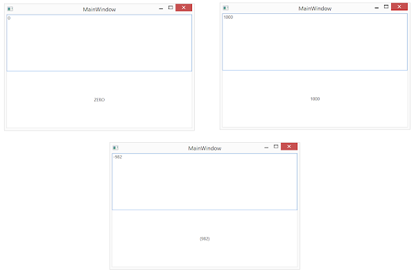
Let's create a view with a TextBox and TextBlock. We need to view the formatted value in the TextBlock as entered in TextBox. But the requirement is that positive values should be shown as entered and negative values should be shown in a paranthesis. Zero value should be displayed as literal "ZERO" in the TextBlock.


Now let's have a look at the value of StringFormat specified for the TextBlock.Text binding. It uses section separators to declare format. Here are the three sections in the specified expression.


Now let's run the application. Here we enter zero, positive and negative values and see the expected result.


Here we don't have to specify all the sections. If we want to apply the same formatting for negatives and zero {0:#;(#)}, we can just use two sections. The formatting specified in the second section would be used in for both of them. If we want to use the same formatting for all positive and negative numbers and need to use a different one for zeros, we can leave the second section empty {0:#;;ZERO}.

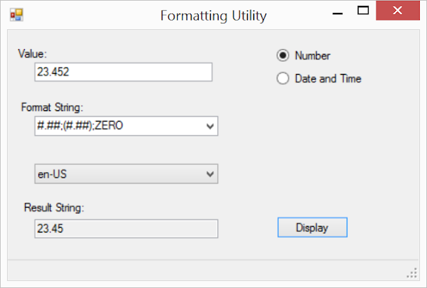
In order to practice further with formatting, you can download this cool utility from Microsoft. The tool allows you to provide custom formatting and displays result so that you can test the expression before using it in your application. You can download the source code of the utility.


Saturday, March 1, 2014

WPF - Ellipsis for Overflow Text in TextBlock

This is a very short post discussing about how to accommodate the overflown text in a text block when we don't want to wrap. Let's see what I am talking about. Here we have a Text Block showing the first name of a user. Since names can be longer than whatever we plan for in this view. We don't want to wrap them into a new line. We also want to show ellipsis at the end to show the presence of hidden text part.


In order to do that, WPF has provided TextTrimming property in TextBlock. In order to get the above result, we can just provide the TextBlock definition as follows:


Here we are using the ellipsis on word boundaries. We can also use it on character boundaries. We just need to set it like this:


And it should show up like this: